Animated React components
41 animated, accessible components. Open one to try it, read the code and install it with the shadcn CLI.
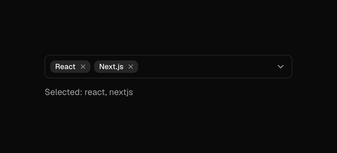
Animated Multi Select
Searchable multi-select with animated chips, built on cmdk and Radix Popover with full keyboard support.
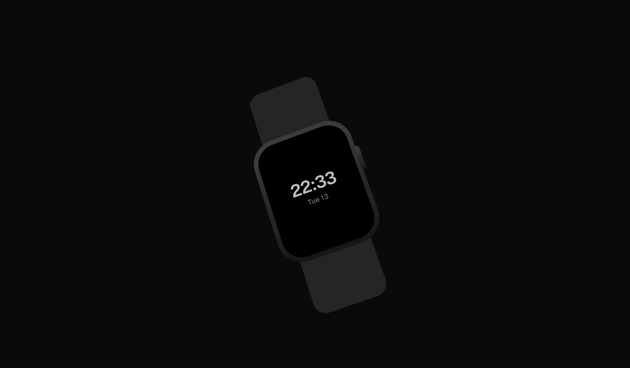
Animated Smartwatch
Scroll-driven smartwatch mockup that rotates into view, with a live clock face or your own screen content.
 New
Arc Scroll Steps
Scroll-driven stepper: numbered steps orbit a large arc and the active step's title swaps in as you scroll.
 New
Availability Card
Hire-me card with a live availability pulse, local-time clock, tactile buttons and a copy-email confirmation.
 New
Bento Grid
Animated bento feature grid: files flowing through an action, drifting category rows, a playable install and a copyable command.
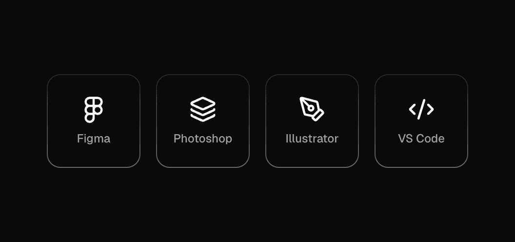
Border Gradient Icon
Icon tile with a subtle gradient border that can render as a link or button.
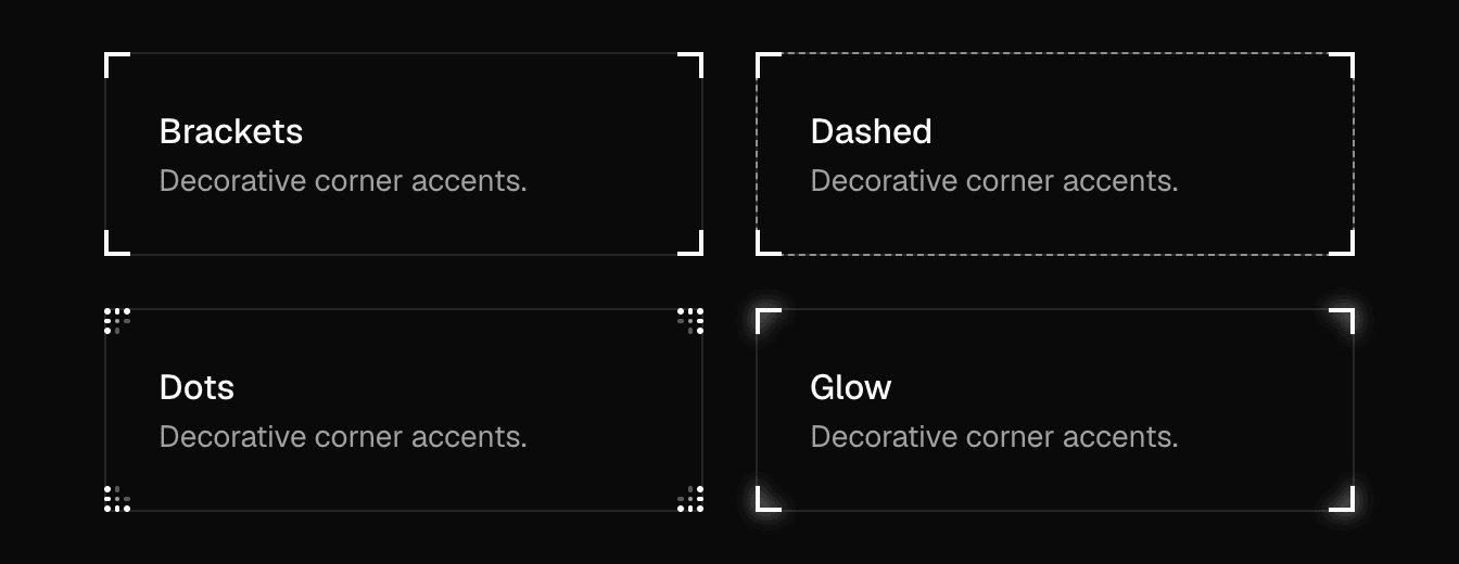
Card Decorator
Decorative corner accents for cards: brackets, dashes, dots or glow, in the current text color.
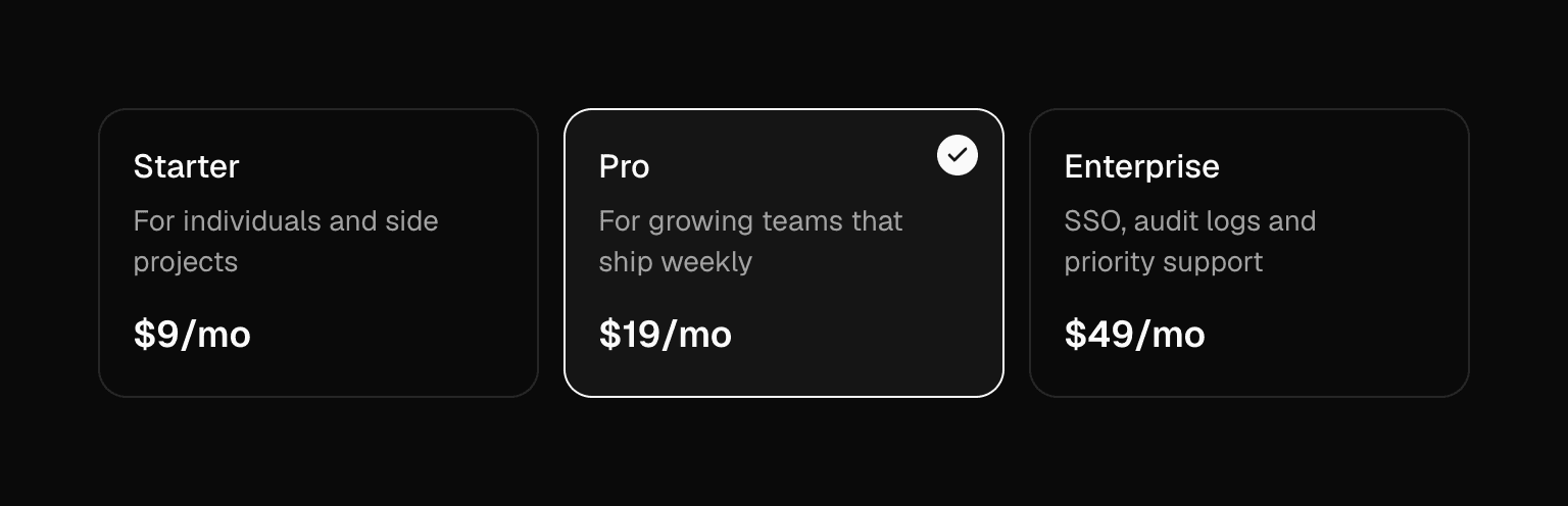
Card Radio
Selectable cards with real radio semantics and arrow-key navigation, built on Radix Radio Group.
 New
Case Study Carousel
Stacked case-study carousel: the active card leads while neighbours peek behind, with arrows, dots, swipe and keyboard.
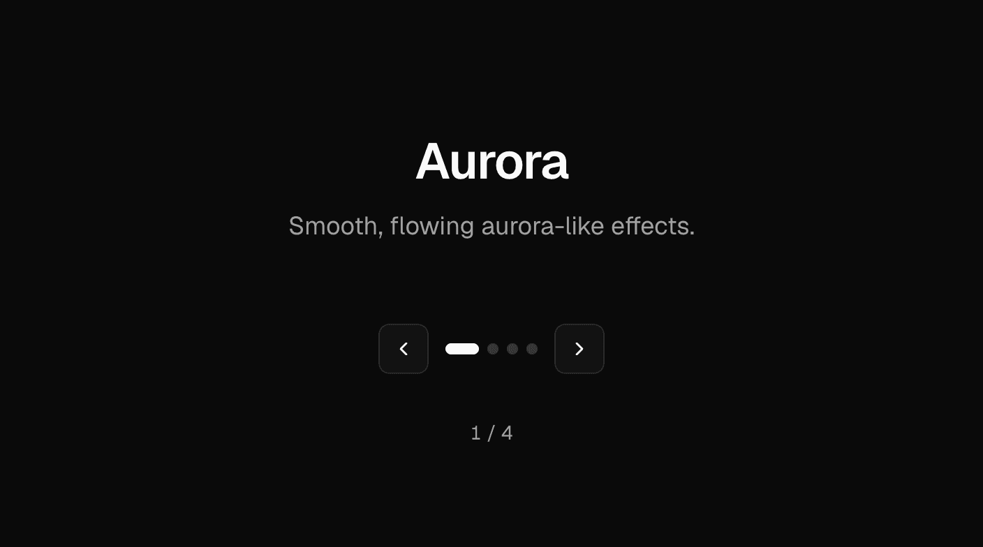
Content Carousel
Step through titled content with labelled previous/next controls, dot navigation and live-region announcements.
 New
Dock Gallery
Bottom-aligned project row that magnifies like a dock: the card nearest the pointer grows and its neighbours step down.
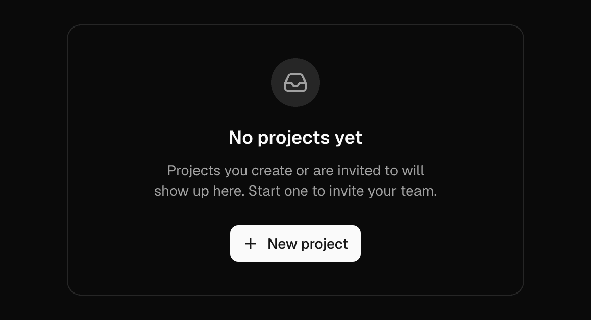
Empty Result
Empty state with an animated icon, title, description and an action slot.
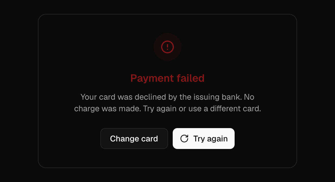
Error Result
Error state announced as an alert, with an animated icon, description and recovery actions.
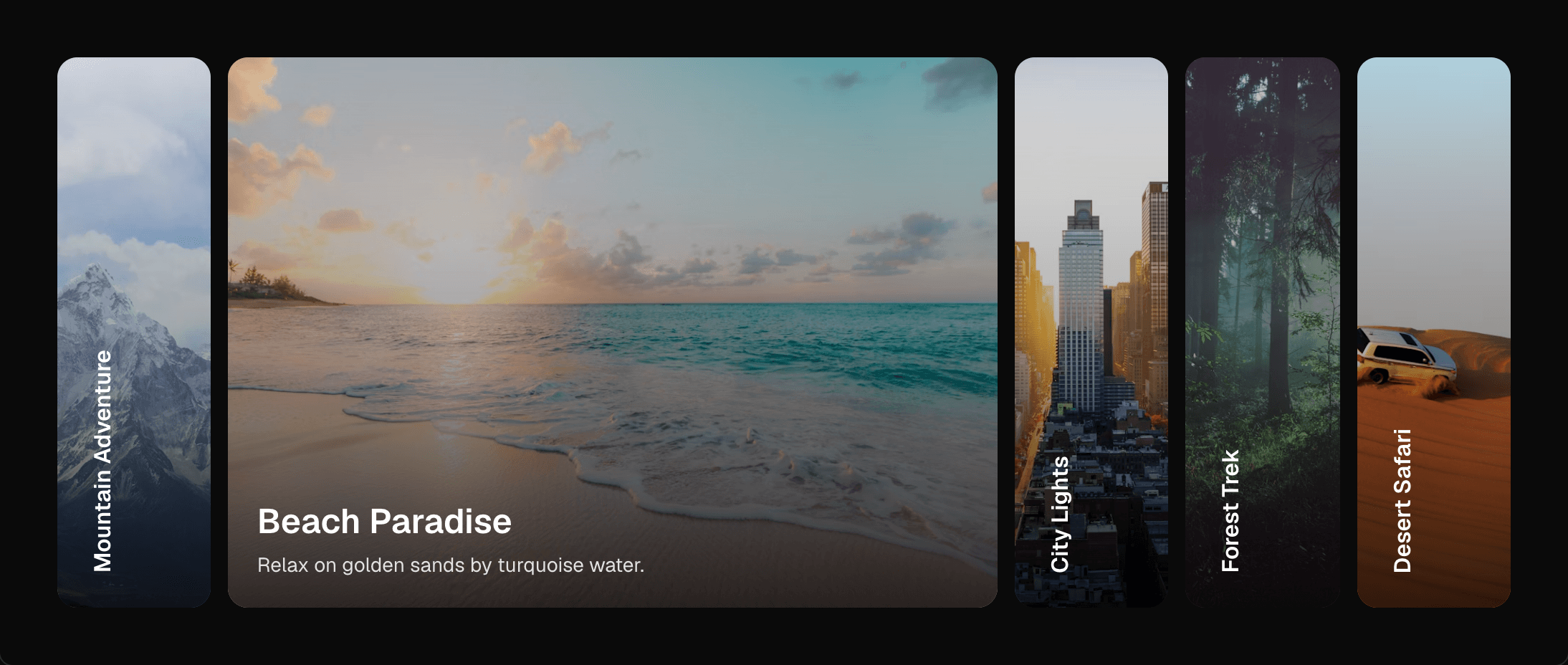
Expanding Cards
Image cards that expand on selection using pure CSS flex-grow transitions, with accessible buttons.
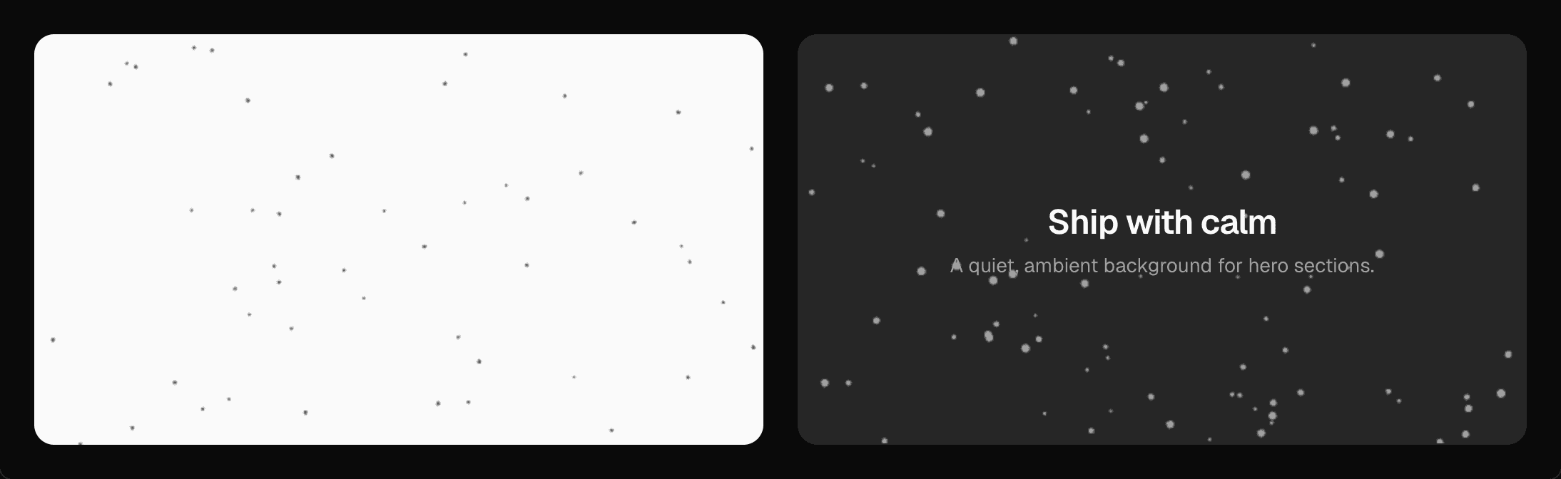
Floating Dots
Lightweight canvas background of rising dots that pauses offscreen, scales for high-DPI screens and respects reduced motion.
 New
Fuzzy Mascot
Plush SVG mascots in 15 shapes whose eyes follow the cursor, with idle, working and sleeping states, five shadings, hats, glasses and fur length.
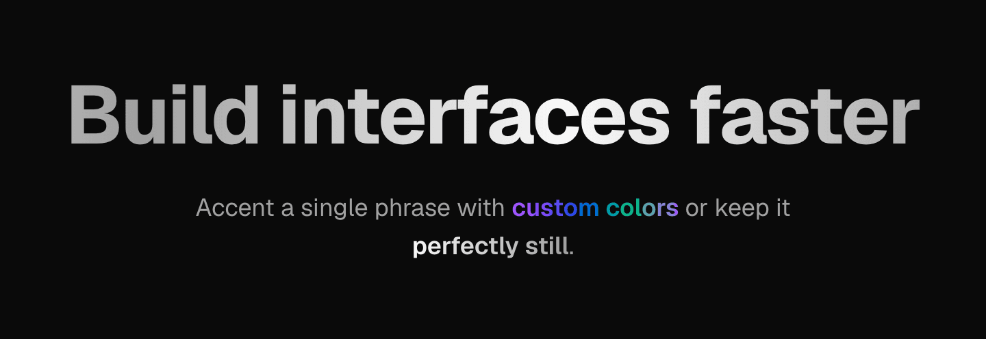
Gradient Text
CSS-only animated gradient text using your theme colors. No client JavaScript.
 New
Hover Expand Gallery
Row of image panels where the hovered one expands and reveals its label while the rest narrow; tap and arrow keys work too.

Icon Radio
Icon-based radio options with a playful check animation, built on Radix Radio Group.
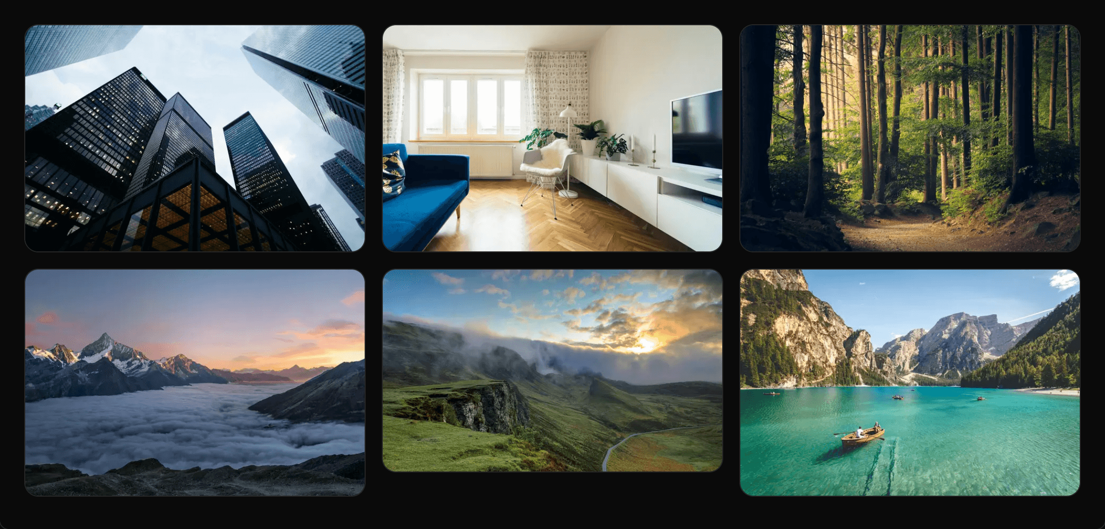
Image Gallery
Masonry image gallery whose items fade in as they scroll into view, with captions.
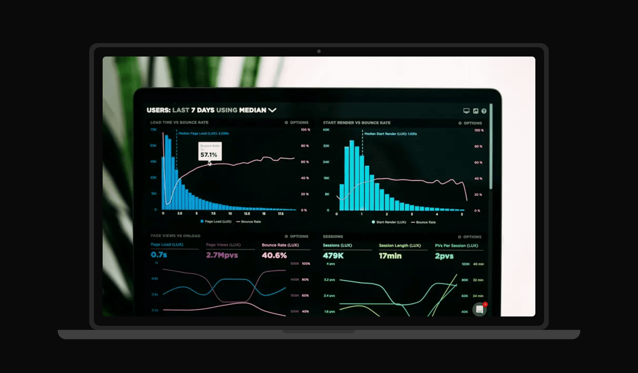
Laptop Closes on Scroll
Scroll-driven laptop mockup whose lid closes as you scroll, with any content on its screen.
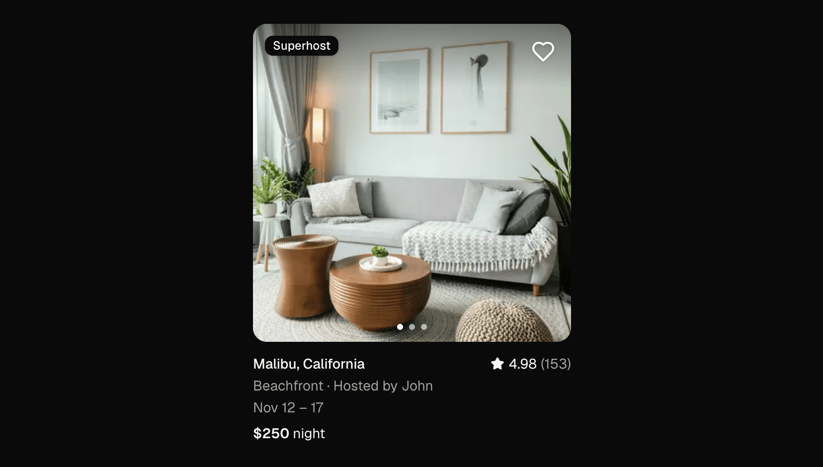
Listing Card
Rental listing card with a swipeable scroll-snap photo carousel, rating, badge and a controllable favorite toggle.

Loader
Accessible pulsing-dot loader that inherits the current text color, in three sizes.
Logo Cloud Carousel
Infinite CSS marquee of logos with hover pause, edge fade, dark-mode logos and a reduced-motion fallback.
 New
Mission Bento
Stats bento with a masked heading reveal, staggered tiles, count-up numbers and a self-drawing trend arrow.
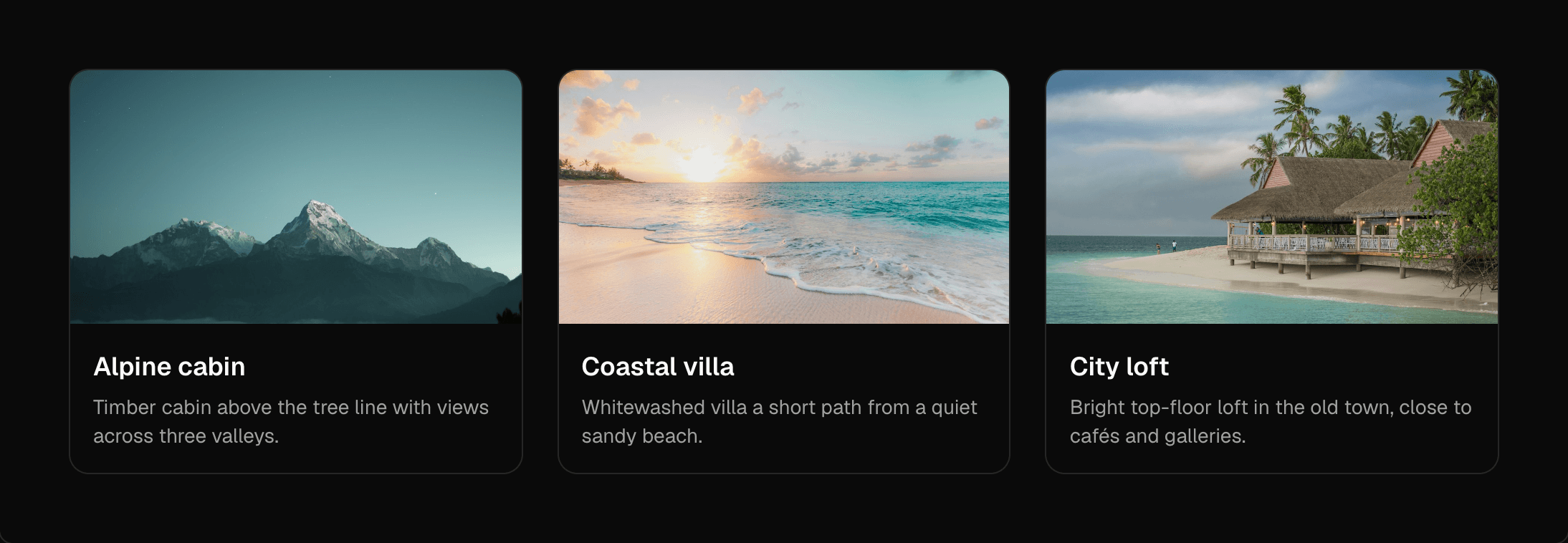
Morphing Card
A card that morphs into a dialog with shared-layout animation, built on Radix Dialog for focus and Escape handling.
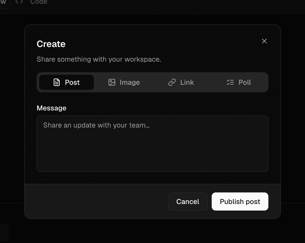
Morphing Modal
A dialog that grows from its trigger and contains animated tabs, built on Radix Dialog and Tabs.
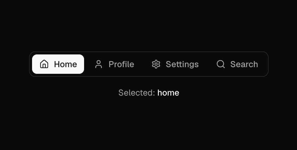
Morphing Nav
Segmented navigation with a sliding active indicator. Renders links or a keyboard-navigable radio group.
 New
Now Playing Card
Music widget whose album art spins as a vinyl disc and morphs into the full cover on hover, with a live progress clock.

Pricing Card
Plan card with price, period, feature list, badge and a call to action.
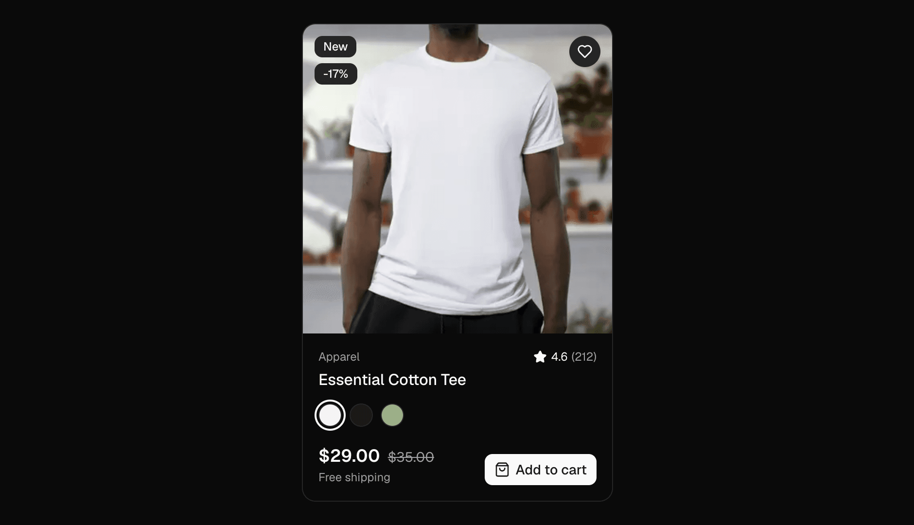
Product Card
E-commerce product card with color swatches, wishlist toggle, ratings and add-to-cart.
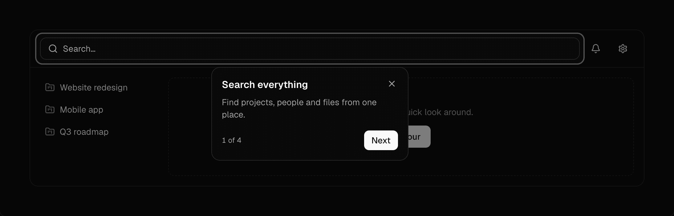
Product Tour
Step-by-step spotlight tour with smart card placement, keyboard navigation and focus management.
 New
Profile Card
Social profile card with accent-tinted wave cover art, verified badge, follow toggle, stats and link.
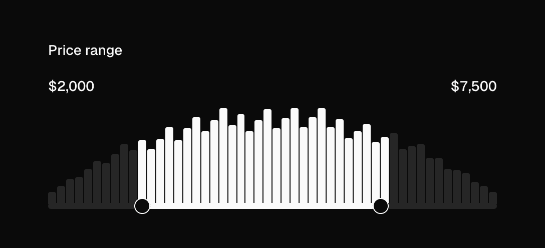
Range Slider with Histogram
Dual-thumb range slider over a histogram that highlights the selected range. Controlled or uncontrolled.
 New
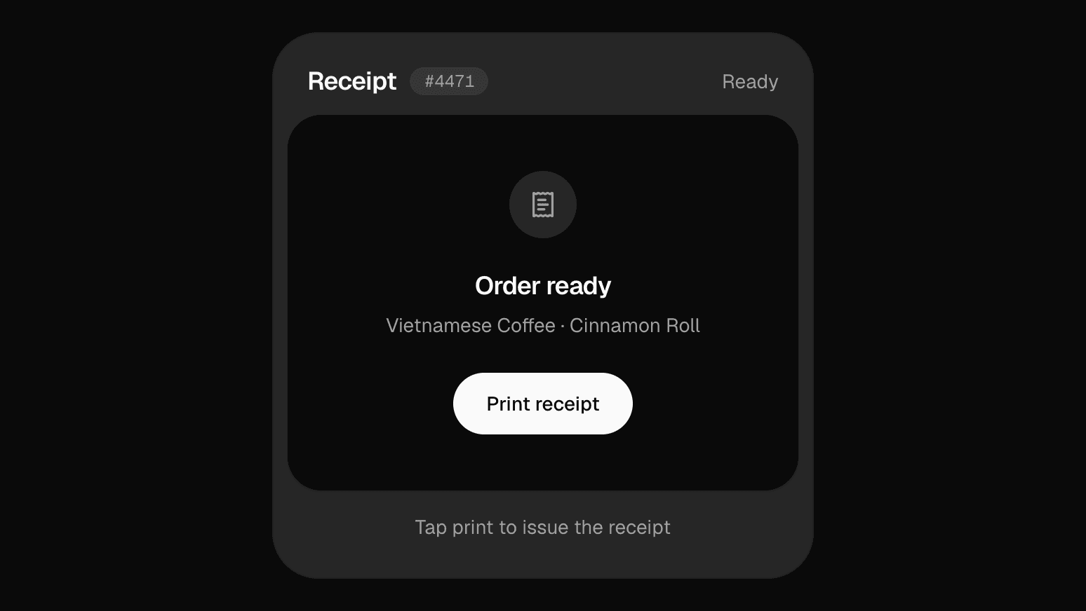
Receipt Printer
Order card that prints a torn-edge receipt line by line, with itemised totals, a pay-by-QR slot and tear-off reset.
 New
Reminders Card
Widget-style checklist with a glowing accent header, live clock, animated checkboxes and inline add.
 New
Showcase Bento
Animated showcase bento: hopping team portraits, a count-up stat, rotating testimonials and drifting framework and tech rows.
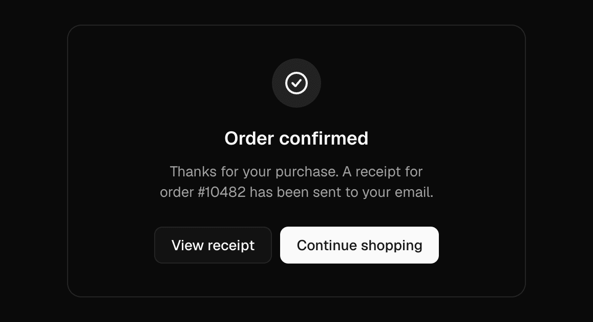
Success Result
Success state with a self-drawing check icon, announced as a status, plus an action slot.
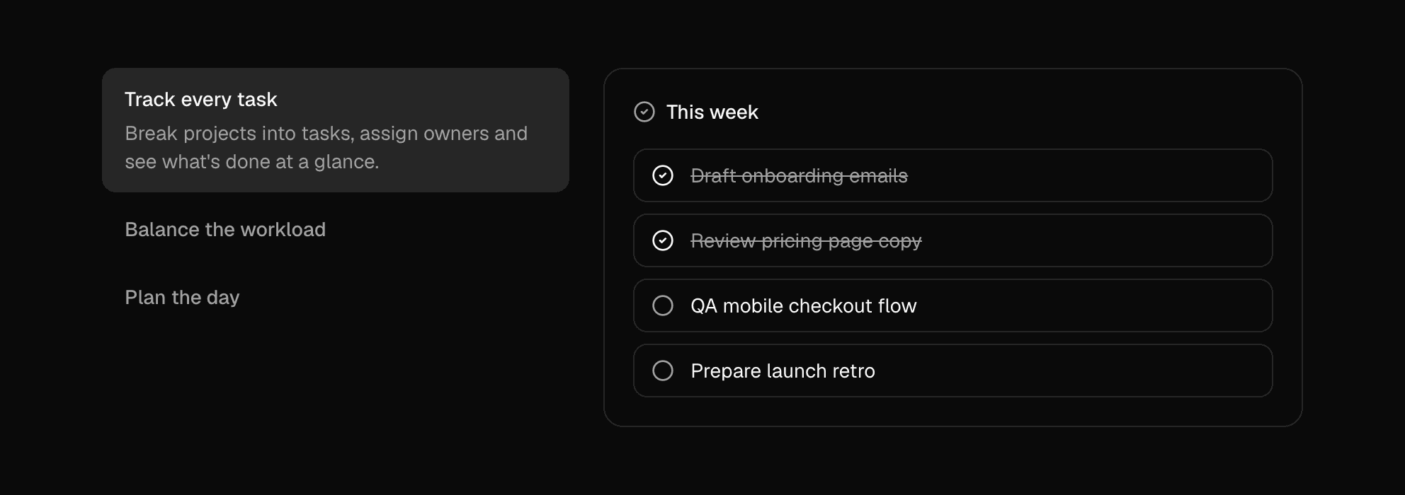
Tabs Switcher
Feature tabs with descriptions and cross-fading panels, built on Radix Tabs.
 New
Team Carousel
Infinite Embla carousel of team portraits that pauses on hover, lifts the hovered member and highlights their division.
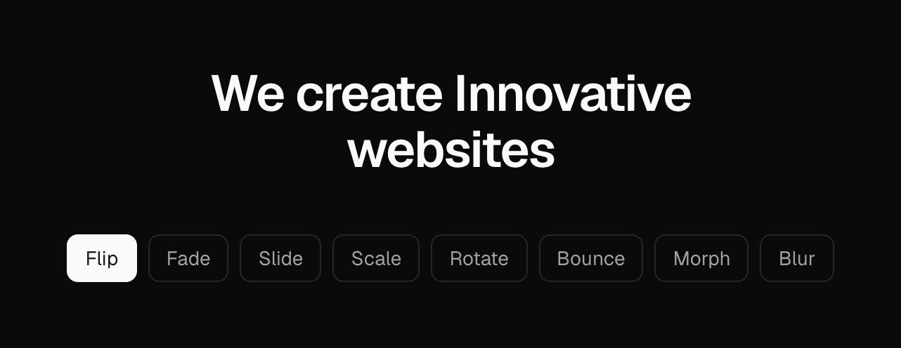
Text Effect
Cycles words in place with eight transition styles, sized to the longest word so nothing shifts.